10/xx/2017 A look at providing high capacity transit from Aurora to the Central District
Credit: The Urbanist, Seattle Subway
Sound Transit 3 does many things right. And Seattle Subway, the organization largely responsible for ST3's general alignment plan, has crafted a full-featured vision for the Seattle Region's future.
But serious gaps still exist in some of Seattle's densest neighborhoods. Belltown, originally passed by during the initial construction of the Downtown Seattle Transit Tunnel so that suburb oriented bus lines would have easier access to downtown, is likely to never get rail service under any Sound Transit (ST) projects. First Hill, the densest part of Washington State, was separated by I-5 and feels far away from nearby downtown thanks to hills, pollution, and choked streets caused by I-5.
Although not very dense, the Central District has similarly been ignored by rail transit, and challenging geography makes buses slow through the hills to downtown. Aurora, although served by RapidRide, feels far away from downtown, and is chock-full of low-density businesses and is overrun with cars.
I believe that a Seattle constructed monorail is the best option for a corridor stretching from Aurora to the central district. In a series of posts, I will make my case by investigating the neighborhoods, funding methods, vehicle types, and
Neighborhoods
Too often we try to find the solution to a problem: The Seattle Streetcar lines are a perfect example of this. Interests were primarily concerned with the streetcars as an idea in and of themselves. Certain street intersections were so full of existing trolley wires that a custom, far more expensive streetcar was needed, despite bus infrastructure covering most of the route. As a result, both streetcar lines to date are better as mobile advertisements than actual transportation methods.
But that's the tricky thing about infrastructure: once it's there, improvements are generally better than reconstruction elsewhere. The Center City Connector will likely vastly improve the ridership of both streetcar lines. Although ridership estimates are likely far too high, the CCC should prove to be worthwhile for at least some transit users in downtown.
So to avoid another streetcar disaster, let's start with evaluating the alignment first, and consider the type of transit afterwards.
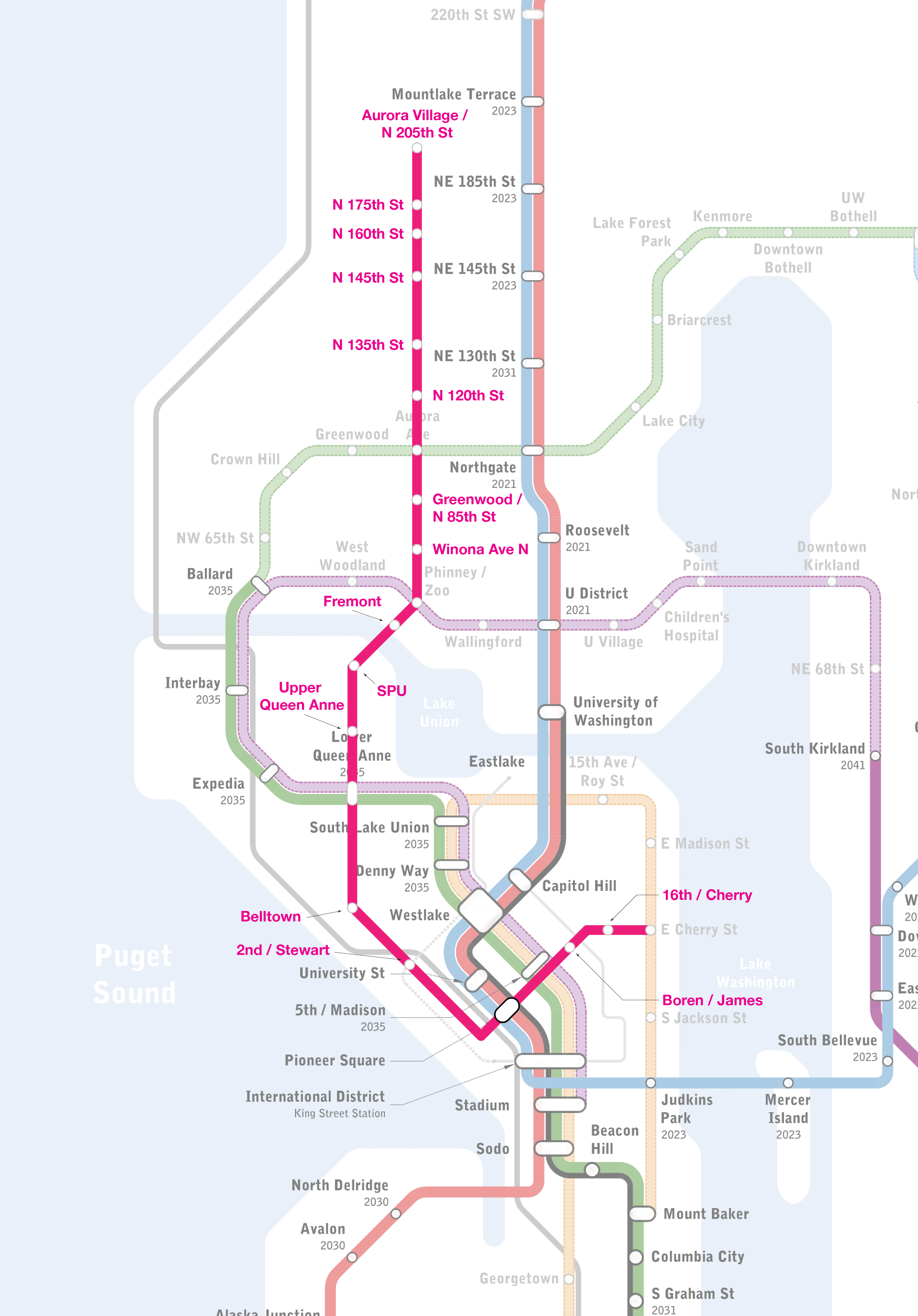
When considering the Seattle Subway vision plan, a number of shadows appear in rail coverage. These communities can be grouped into three sets of two each: the dense yet underserved First Hill and Belltown; the lower-income and diverse Central District and Aurora; and the affluent and desired Fremont and Queen Anne.
Dense and Underserved
Belltown and First Hill are the densest parts of Washington State that still lack high capacity transit. Home to TODO: XXX people,
Examining Transit Types
It's well known that Seattle has
The transit type should be grade separated to allow for higher speeds, both intra stop and by avoiding traffic slowdowns. This also provides for much higher frequency.
Seattle can use its still-existing taxing method to create the line.
The line must be rubber on concrete in order to combat the high grades of 9% or more along the alignment.
Rubber on wheel trains typically run warmer and require extensive HVAC underground, but as an elevated alignment, this problem is alleviated.
A third rail is possible, eliminating canelevers and their unsightliness
Traditional double wheeled cars (a la Taipei) create large shadows and remove sunlight from the street
The monorail is the last option standing and also provides some upsides
A svelte appearance that can be kept relatively low to the ground will help to keep business leaders from blocking the construction.
Only one lane of roadway will be required for center or side running pillars.
Elevated platforms can be placed to the side or directly over the roadway, whatever is cheapest
Finally, monorails have an undeniable "cool factor." It's why despite adequate bus service to and from the Seattle Center, most tourists take the monorail to Westlake and allow the service to break even.
Why this alignment?
Why Aurora?
Aurora offers a fantastic opportunity. Primarily, Aurora has a large, government-owned right of way. It's flagged on both sides by mostly low-density businesses with large parking lots. Aurora is already being upzoned
Aurora is ripe for pedestrianization. One lane to the monorail, the other transit lane to improved sidewalks
Cosntruction impacts can be limited by prefabricating the pillars and trackway for in place assembly, or sacrificing the turn and transit lanes for substantial staging of construction
Track Power Stations will be easily placed along Auroras corridor
Why Belltown?
Belltown has no transit yet, but does have alignment. Belltown is very dense, and has great bus transit, but poor rail transit.
Challenges
Nimbyism
Back when light rail was being planned to the north, ST investigated placing light rail down the center roadway of Aurora. They found that timing was longer, and that the line would not serve as many people. Thankfully neither of these thigns are an issue.
Another aspect of the project was not discussed in the EIS; nimbyism was highly prevalent with Aurora's business community, as they worried that road closures and construction would keep people off of aurora and strangle their busisnesses. Similar issues with lighting with an elevated alignment.
Queen Anne will fight a station at north Queen Anne
Fremont will need special consideration due to historical and deep cultural roots
Madrona will pull a Queen Anne
A belltown station will either stradle the road, or need to b e built directly into a building. The first option will be fought and the second requires immediate action.
The spectre of the monorail project. SPOOPY
Technical
A tunnel under woodland park zoo, and or a tunnel under queen anne could create technical challenges and dramatically increase the overall cost. OF first concern, a future Ballard - UW Link alignment seems almost garunteed for ST4, and underground work for ST would be complicated by the construction of an underground Greenlake to Fremont Alignment.
electric motors are well suited to elevation changes, and is the primary reason for our current trolly bus system
The City of Seattle is the only govenrment agency with both the funding authority and institutional clout to make this happen.
Alignment options
NE 145th to NW Greenlake
centre running
side running
NW Greenlake to Fremont
underground
centre running
Fremont to Seattle Center
via SPU
via Aurora
via Dexter
Seattle Center to Madison
via 2nd Ave
via 5th Ave
Madison to Central District
to Madrona via Madison to Union
to Madrona via Union to Union
to Roosevelt via Cherry, Cherry Place, Cherry
to Roosevelt via James, Cherry
rough cost estimate
rough population estimate
rough vehicle estimates
Operations and Maintenance Facility
Put it somewhere on Aurora. Likely expansion to the north into Shoreline, or east to Lake City means that a OMF around 100th would be near the center of the line.
Due to completely elevated and grade separate systems, the line could dead head vehicles at the ends of the line
Future Expansion
Once built, Seattle could consider future expansion in tandem with Shoreline, continuing the monorail north to Edmonds, downtown shoreline, or a swoop around to the future Shoreline link stations.
Future expansion is unlikely however; Shoreline will already receive link stations, and any further expansion long 99 will require no fewer than 4 municipalities to agree on alignment, cost sharing, and operations.
Why Now?
Land costs in Aurora are depressed compared to the rest of the surrounding North Seattle area, but that won't be the case for long. The City of Seattle is currently working on upzoning areas around Aurora, the land costs will increase. Similarly, we have the political willpower and, depending on election results, the required city leadership to push this through.
League of Legends is the most played videogame in the world. Played by tens of millions of players across the globe, featuring over 120 unique champions, and bolstering a competitive system that rivals the viewership of Major League Baseball, LoL is an unequivocal success.
Playable characters, known as champions, are released every two to four months. As the game has matured, Riot has taken more time with each champion to create unique gameplay and compelling backstory.
One of the most anticipating releases was Ao Shin, teased all the way back in September of 2013. Already possessing a strong creative motif and looking considerably different from all other characters then released, Ao Shin was incredible. The hype train left the station firing on all cylinders as people excitedly awaited his release.
But Ao Shin was not to be: Riot repeatedly postponed and ultimately canceled the original incarnation, citing issues with gameplay. Instead, they rolled him into the similarly named Aurelion Sol, announcing with a tremendous teaser
To a League fan, this is basically porn
Designing a champion in League is a bit different from designing in more general terms. Good design is often invisible: I never think twice about a door, because it does its job invisibly. When the door starts to squeak or need pushing to close, then I notice. The exact opposite is true in League champion design: each and every character needs to be immediately and unmistakably recognizable. Champion abilities flash, twinkle and make unique noises. An invisible champion design in League of Legends is a failure.
With the release of each champion, Riot creates an expose of the process. Detailed and fascinating to a hardcore player like myself, the Champion Insights: Aurelion Sol piece shed light on champion creation process at large.
Our concerns led us to trying out other body shapes, and we ended up turning to the night's sky for inspiration, using the idea of a comet - with its burning bright body and faded tail - for our dragon's body
It seems obvious to say out loud, but I'm still learning this lesson: turning outside when stuck for inspiration only leads to great ideas. Despite videogames carrying the weight of basement-dwelling nerds, the heavens itself played a direct role in the creation of Aurelion Sol.
Despite the end goals of the design being so very different from traditional design, the steps taken were much and the same. In a QandA, Rabid Llama reveals that the difficulties are as well. All champions have an ultimate skill they can use only once every few minutes. Usually ults are the defining characteristic of a champion and front-loaded with tons of power, but Aurelion Sol's ult feels weak in comparison to the giant starforging dragon design. (translating into non-league speak here)
Why did you guys give that specific ult? Compared to the rest of his kit, it seems linear or rushed, I mean its cool, but I was expecting some soul, star crushing black hole type ult. –Sate My Devourer [Aurelion Sol has stars that fly around him, making him seem like a stellar creator.] We wanted to focus as much as possible on that novel and fun game mechanic, so we gave it lots of power in the game. We decided on an ult last, and didn't have much power to spare for it. Now, a Star Dragon should probably do something really, really flashy with his ultimate. Like, biggest-thing-in-the-game flashy. And we tried a half dozen different things trying to find it. The trick is, something big and flashy has to have a big impact to feel right, which means more power which we couldn't spare because of his other abilities. –Rabid Llama
Despite being a star dragon, Aurelion Sol needs to be balanced in win rate and general gameplay. With so much power in his orbiting stars, the designers found themselves stuck with removing that power form other locations. Even when they investigated making the skill harder to pull off, they ran up against how complex the star ability was, and couldn't justify a complicated ult either. In the end, Aurelion Sol features a very underwhelming ultimate compared to other champions.
The expose taught me that good design inspiration can come from anywhere, but compelling design takes lots of smaller pieces. Sometimes you have a good piece to start with, like a generic dragon idea, but you know it needs more to be the right decision. Inspiration can take a long time (in this case years!) but if you wait long enough even the heavens will help
For the unassuming, Gallaudet University looks like any other newly-built college campus. Modern architecture, earth toned colors, and a beautiful campus. But spend some time around the people that learn and work there, and you might hear something strange: nothing.
Well, not nothing. Footsteps, doors, and keyboards could be expected. But you won't hear people speaking. That's because Gallaudet University is a school for the deaf and hard of hearing.
Estelle Caswell of Vox Media met with Derrick Behm, part of Gallaudet's Office of Campus Design and Planning to tour the word's first university designed and built in mind with the principles of Deaf Space.
An approach to architecture and design that is primarily informed by the unique ways in which deaf people perceive and inhabit space
Deaf people, as a culture, have been marginalized largely. We've been as a marginalized community, developing new culture that defines what kind of place we call home, how we claim and occupy space. And so we've begun to ask ourselves these questions, and because of that gotten a lot more creative, began to think bigger about how we can find different ways to align our ways of being to our environment.
The level of design thinking and detail orientation is impressive: classrooms are oriented in a U shape so students can always sign with one another; walkways are wider so that people have space to sign and read each other's whole bodies; stairs are avoided in lieu of ramps to keep visual attention away from your feet. The college uses glass liberally so people can see into rooms, elevators, and upper floors.
Color and lighting are highly aligned to communication access. Blues and greens will usually contrast to most skin tones, and help to reduce eye strain. You may want to have more diffused lighting, a lot of the lighting here is directional so that it can be aligned. There are mirrors present to allow somebody to know and have a sense what's happening behind them. Through the use of that reflection they can know if someone is nearing them or behind them.
Very often people refer to hearing loss as an example which negatively frames the whole approach form the outside. But let's imagine the deaf baby who has never heard, yet is still described as experienced hearing loss. Instead we propose a different framing, deaf gain, what is it that we gain by the experience of being or becoming deaf.
And that mantra really shows throughout the campus. This isn't a place that was designed for the hearing and then used for the deaf. Neither was it built with special accommodations. I don't know if I ever heard the words “special needs” anywhere in the video I watched.
Good design is about really questioning why we do the things we do. Anybody could have just said to make the hallways 4 feet wide because that seems like a good width for hallways, but the designers of Gallaudet questioned every bit of their design and building process to make a truly amazing result. It would be awesome to have more thoughtful designers making things as good as Gallaudet
The internet is great at creating community. A great example is Reddit: go ahead and try to find a community that doesn't exist. Difficult, right? You even have crazy subreddits designed for oddly specific things, like /r/birdswitharms. The internet has provided an excellent tool fostering communities
But online, vote-based systems can suffer from a rash that in one way or another affects all parts of the internet: low quality, easily accessible, circlejerk content. That last descriptor, if you're not familiar, is most popular on Reddit, and refers to a discussion, post, or article that tells a subreddit what they want to hear, usually adding nothing of value to the conversation. An example would be entering /r/sandersforpresident and posting about how much you hate Hillary Clinton.
Others join into the circlejerk by popoularizing the low-quality content, and adding their own low-effort comments and opinions. This also famously happens in the comments of post-match discussions for /r/leagueoflegends. Almost every top level comment is 10 words or less, usually referencing some stupid meme.
Some communities fight the descent into Idiocracy with hard-core moderation and enforcement of rules. But the fact of the matter is that the strongest meme survives and spreads, like a viral infection. The most popular, most accessible content wins out across the net.
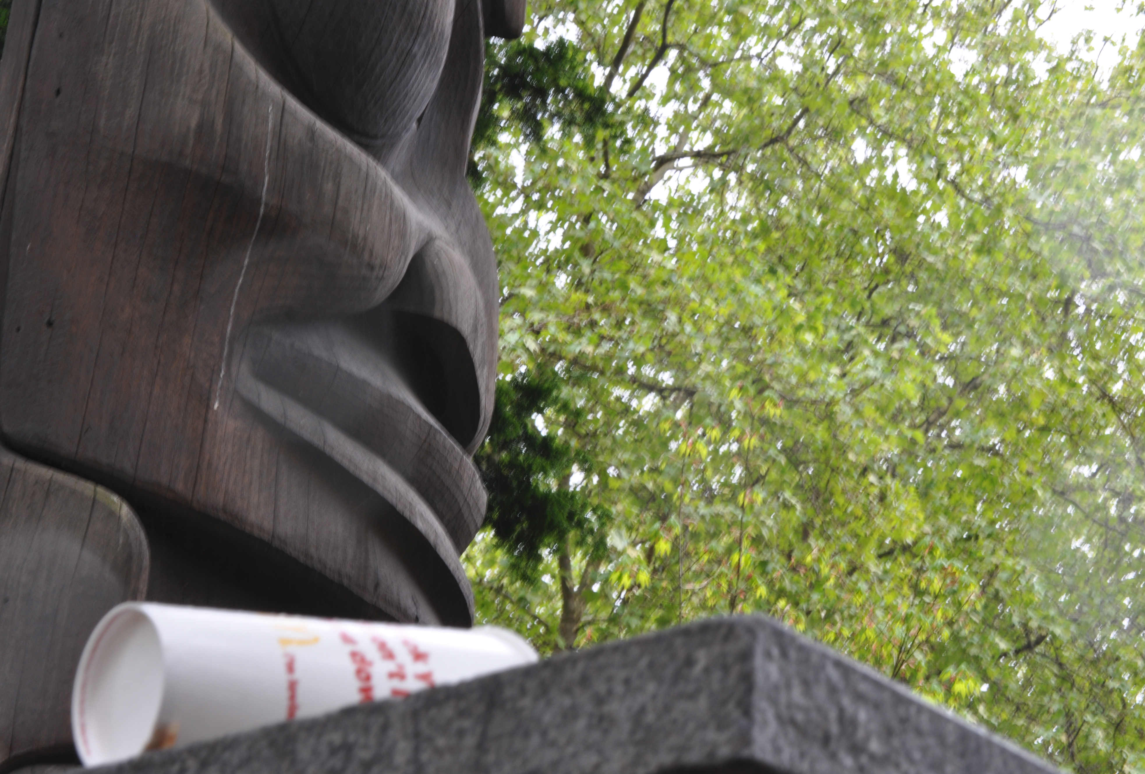
Intercom is a company that designs customer communication with a focus on making it more personal. An Intercom designer posted today's article to Medium, complaining about how the site Dribble pushes forward shallow design. While everything may be a pixel perfect creation, there's no reason or underlying need for any of the work.
The offending photo features a totem pole with paint on its eye and McDonalds trash. I think an explanation is unnecessary.
Let's find a random design on Dribble and look at the feedback. “Nice style!” “Great shot” “Amazing!” Now, I'm no designer by trade, but I can tell you that when I took the Art school's intro to design, I never heard a single bit non-constructive feedback. (I'm proud to be able to say that I had one of my pictures called “offensively cliché”). I had my work ripped into, torn to shreds, and otherwise demolished. But out of the critiques, I was able to move my design forward, and come up with reasons why I did the things I did.
This is a site for designers. Yet there isn't a bit of explanation for the process, critique of the product, good or bad, or anything besides a bunch of praise. This is the definition of circlejerking.
The writer goes on to talk about how real design has real explanations; there's a process, and the process is often more important than the actual product. On Dribbble, it's impossible to tell what things are anymore. Weather apps blend in with accounting screens, flat design reigns supreme, and critique, comments, and users all respond to the most easily accessible and visually pleasing piece. No one asks what the app is supposed to do.
Good design is done to make sure that a user can use the product easily. I agree with the article; the ease of accessibility is turning the community into a giant circlejerk board, deprived of any actual high quality work.
Driverless cars are on the horizon. Almost a dozen companies are publicly and actively working on fully automating car systems, and Elon Musk, founder of Tesla, anticipates a fully driverless, street-legal car within the next 2 years.
This sudden sea-change in the primary transportation mode of Americans has many abuzz about what the future of our cities look like. Patrick Sisson of Curbed reached out to professors and researchers at many of our country's finest universities to see what they think our cities will look like after a robotic car revolution
The biggest impact is going to be on parking. We aren't going to need it, definitely not in the places we have it now. Having parking wedded or close to where people spend time, that's going to be a thing of the past. If I go to a football game, my car doesn't need to stay with me. –Alain Kornhauser
It really depends on how many people let go of personal vehicle ownership. I think we'd lose 50 percent of parking demand. If everyone did it, you could get rid of 7 out of 8 cars on the road, so you'd need an eighth of the spots. – Kara Kockelmann
In this environment, you don't need to park your car, it'll park by itself, so you can think about recapturing the space from the front of one building to the front of another building. It does become a pedestrian-dominated environment, where these vehicles would need to take a more subsidiary role – Gerry Tierney
There's clearly plenty of enthusiasm and optimism amongst the interviewed. The excerpts gathered evoke images of people whisked down near-empty streets, the removal of ugly car garages, and more public space for individuals.
But dig deeper; compare and contrast the various views of the future, and it's clear that while people are fairly optimistic, they don't necessarily share congruent ideas. Kornhauser says we won't need parking anymore, as our cars will drive home after dropping us off. Kockelmann imagines an autonomous fleet of shared vehicles in a city with extremely low private vehicle ownership. Tierney sees a drop in vehicle use overall, making people opt for a pedestrian form of transport.
Clearly, autonomous cars will change the way we commute. But no one can seem to agree exactly how that will happen. Each one of these ideas paints a rosy picture and ignores the problems with the specific implementation.
Let's start with Kornhauser. If parking is removed from our destinations, our cars will have to go elsewhere to park; In this example, back to our homes. While destinations become more pedestrian friendly, car trips are doubled, increasing emissions, energy use, and overall traffic. Sure parking just became easier, but you now have doubled emissions, doubled traffic congestion, and doubled your annual vehicle ownership costs. This is not a solution, this is a disaster.
Kockelmann similarly sees exactly everyone giving up personal vehicle ownership, driving down total vehicle numbers and parking space. But most American cities are commuter cities; people come in the morning, and leave at night, all at the same time. Sure, people may carpool, but the number of required cars still needs to be high enough that everyone can get a ride at the start and finish of the work day. If they can't, they'll shell out for a car of their own, defeating the purpose of vehicle sharing.
Tierney sees cars parking… well… somewhere. I already talked about cars returning home, so what would happen if they stayed nearby? Thankfully Tierney sees the problem
We have to start thinking about unintended consequences. Where will the garages be where we store all these cars? We have to be careful that we don't start locating these in communities where the land values are low. The wealthy will have a bucolic public realm, where the poor areas will be besieged by autonomous vehicles like a swarm of flies. We have to be conscious and make sure we don't let this happen. Right now, this whole brave new world is presented with 20- and 30-somethings enabled, wired up, and dialed in. They're calling their Ubers and having a grand old time, and then down the corner, the cleaning lady is standing on the corner waiting for the bus that isn't coming. We just can't have that happen. If we're moving toward this autonomous, decentralized transit system, we need to make sure that it's accessible to everybody, that there's a social equity concept in the design – Gerry Tierney
Many people see driverless cars as a cure-all to America's transportation problems. Doing so ignores the fundamental fact that cars force us to design far too much space for transportation than needed.
We have a chance to be visionary about the post-car future of our cities. Our love affair with single occupancy vehicles is ending with fights over the environment, time lost driving, and health issues from sedentary living. We must not give in to the enticement of a cure all system. It's unfortunate to find so many of our universities' brightest falling victim to pie in the sky ideas.
One of the base, most important parts of the internet is Internet Ptotocol version 4. IPv4 has been around since the first couple of computers were strung together back in the early 80s. Visually, its divided up into four 0-256 numbers, separated by dots in a form similar to 123.45.67.89 . If you're specifying a port, type it in at the end preceded by a colon, like 123.45.67.89:80.
Despite being far evolved from the primitive tech of the 80s, we still use IPv4 as the standard for most networking needs. This presents a problem: 256^4 is only 4.3 billion, meaning the internet has been limited to 4.3 billion addresses. Device ownership has since exploded, resulting in an IP address squeeze.
Thankfully, the great gods and goddesses known of the internet, known as the Internet Engineering Task Force, forsaw this problem and came up with a solution in 1998: IPv6 (IPv5 was used for packet streaming). While IPv6 now allows for 340 undecillion addresses, obviously accounting for future growth, the syntax for IPv6 gives pause for concern.
Most people today rarely type in IP addresses manually. The Domain Name Service thankfully changes easy to remember domains like google.com into the IP numbers. The two exceptions are sys and net admins, coincidentally, the people who decide if a company should upgrade their internal networks to IPv6. This is a problem Adam Ierymenko, cofounder of Zero Tier, writes about in this week's blog.
Adam works with companies and corporations to upgrade their internal networks, and found many people saying nodding and smiling, yet doing nothing about the upgrades.
Unfortunately our IPv6 advocacy has largely fallen on deaf ears. We show our customers the benefits of IPv6 both on private networks and globally and they nod and smile and then go back to using IPv4. After a few private conversations with customers and also after reflecting upon our own IPv6 experience, I think I understand the reason. A theme that keeps coming up over and over again is the inconvenience of IPv6 for admins and developers, and the IP format seems to be the top complaint.
See, it turns out, IPv6 is just awful for humans to rationalize and use. Instead of all numbers, IPv6 uses hexadecimal broken into eight groups of four digits by colons. An example would be 1234:5678:90ab:cdef:1234:5678:90ab:cdef. Confusing things, much of IPv6-land is 0's, as we're missing a few undecillion devices to fill up the ranks. Most addresses would look like 1234:0000:0000:0000:0000:0000:bc23:0001. Thankfully, IPv6 introduces a shortcut, the double colon. Valid IPv6 can be shortened be omitting as many consecutive 0's, and any preceding group zeros. This makes the previous address look something like 1234::bc23:1 . Adam terms this “colon cancer”
The first problem with this character is that to type it requires the extra ergonomic hassle of depressing the shift key, but that's minor compared to the syntactic nightmare it represents. The : happens to also be used in URLs, configuration files, and countless other settings to separate host names or IP addresses from ports or other information.
What happens if I want to specify a certain port? Well, turns out I can't use the colon, and have to wrap everything in brackets! http://[1234::bc23:1]:433 . Yay!
IPv6 is so obfuscated, Adam makes the argument that it would have been better if we just didn't even have any shortening at all!
Here, let me fix that for you:
deadbeef000000000000000000000001
2607f2f8a36800000000000000000002
fe8000000000000003ceecdfffe30c27
fe800000000000000000000000000001
2607f8b040078090000000000000200e
That's better. Seriously. Double-clicking on any of those highlights it, allowing for easy cut and paste. It's also a lot easier to visually match netmasks and generally see what's going on. While the addresses are indeed longer, cognitive load is decreased.
Now that we're back at step one, Adam suggests a much simpler alternative with the help of Reddit and HackerNews readers: a double period.
Given that .ca is a domain it makes sense, and two dots is more like a keystroke and a half since your finger is already there and only one finger is used. In spite of DNS being very old and very established, people who work with networks a lot still find themselves constantly dealing with IP addresses manually. Maybe that is the real problem.
One thing is clear: IPv6 is a mess. While we're practically guaranteed for the full existence of humanity to never run out of IP addresses, and while computers clearly have no issues interpreting and using IPv6, we've screwed the pooch by making it difficult for us to understand. It seems all too funny that the humans who designed IPv6 forgot that humans need to be able to read it.
The lesson here for me (besides that IPv6 is slightly painful) is that while you may be designing for one audience, sometimes you have hidden stakeholders that you should cater to. Any number of design options, easily thought up in a few minutes by internet commenters, are superior to the current method, all because the creators designed for machines and not people.
Human Immunodeficiency Virus
2/5/2016. This is not a post for INFO 360
I met a guy over Tinder. I was watching a Democratic debate, and was quite drunk. I ended up yelling through chat about how much I disliked Hillary, the Republican Party, and overall establishment politics. Eventually I fell asleep and thought nothing much of the interaction.
The next day we kept talking though. I apologized for being so drunk and boisterous, but he assured me that at worst it was hilarious, and best, intriguing. So we kept talking and talking. We exchanged numbers, and talked some more. Finally, we met.
I remember getting dressed up, trying to look my best. I obsessed over my hair, white hoodie, jeans, and Mantis shirt (based off FTL). I aimed for sharp, but casual, to make a good impression. We agreed to a restaurant and time, and off I went.
"Play stupid games, win stupid prizes"
I remember laughing because while I had put at least half an hour of effort into my appearance, it looked like he had put in almost none. From the graphiced, loose fitting hoodie to the esoteric haircut, I somehow felt a bit overdressed in a hoodie. But despite the silly appearance, we hit it off harder in person than when we were talking over text. Despite huge differences in friend groups and backgrounds, we ended up both speaking the same languages, having the same values, and appreciating one another's company.
Scheduling was hard, but we found time to date about once every two weeks over the course of a month and a half.
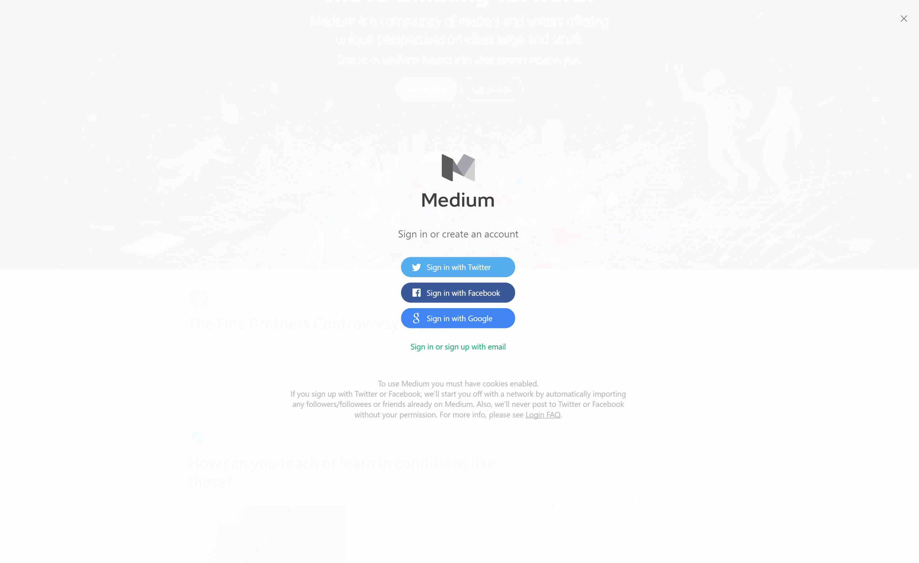
I made the mistake of clicking on the "Get Started" button sitting on Medium's website this morning. I've loved reading the blog posts on the site recently, and was curious if I could have a bit more control over the types of blog posts I read if I clicked the button. Instead, I was brought to an overly-flat signup popup. The design made it clear through slight transparency that the popup was actually an overhead, sitting above the homepage. I quickly decided I was lazy and didn't want to sign up to Medium, so I tried to get out of the prompt.
Immediately, I found myself clicking just to the outside of the prompt, something that usually closes these full page interruptions. This did nothing. I then looked underneath the icons, hoping for a "close" prompt, but to no avail. Finally, I started scanning the edges of the screen from the top left to the top right, until I finally saw a tiny X, at 30% gray, nearly invisible to me. It took me three tries before I found the way out
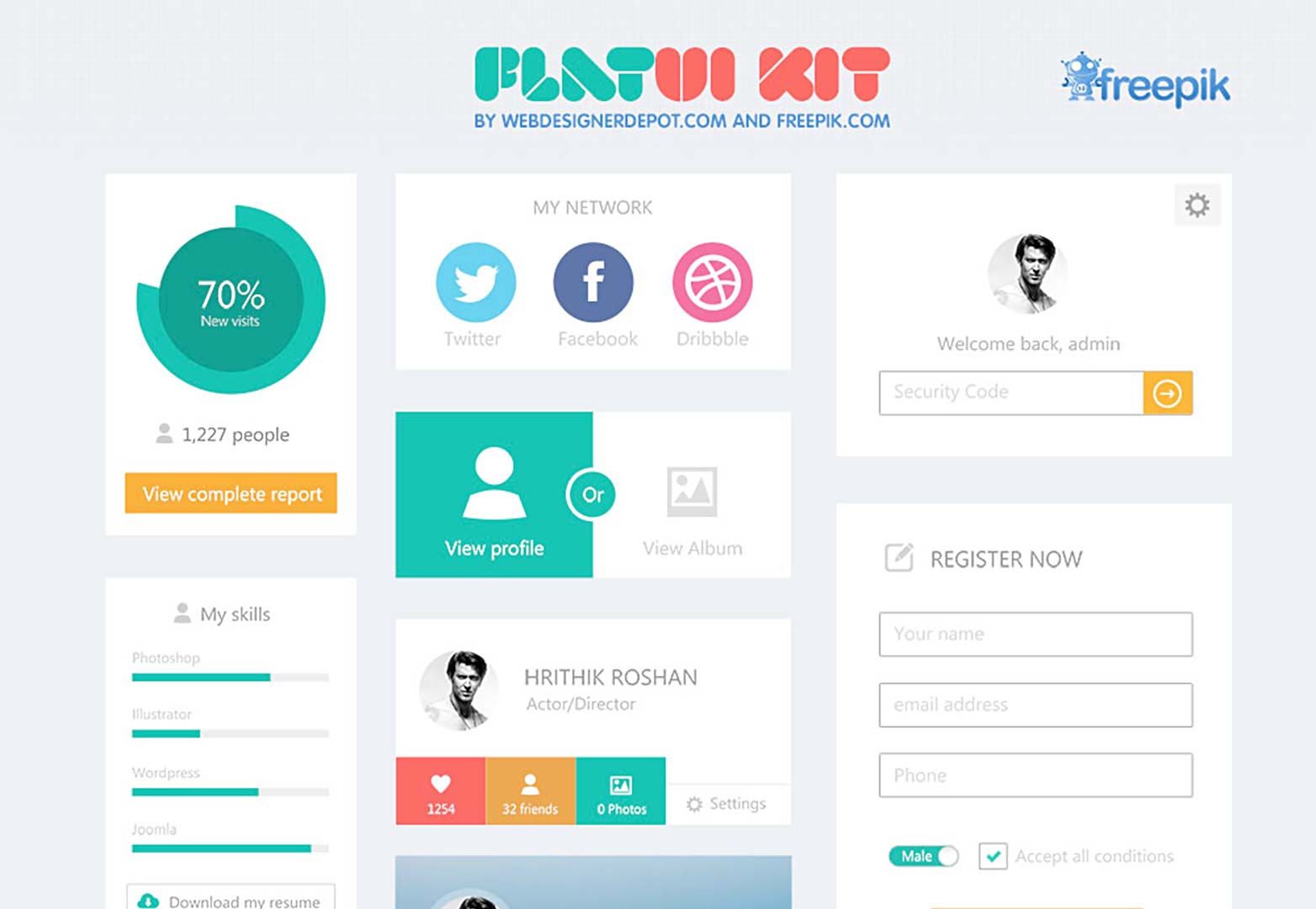
Kate Meyer is a User Experience Specialist, working with Nielsen Norman Group, an "Evidence-Based User Experience Research, Training, and Consulting" firm. NNg performed an experiment to investigate the usability of such "ultra-flat" designs: themes which rely on bold colors, overall minimalism, and low text contrast.
But let me ask you a question: On the above site, what happens if you click on "My Skills?" Is that a link? Will it take you to a different page, open a dialog box, or change information on the current page? Is it just a section header? The element in question lacks what Kate calls "strong signifiers," or visual cues that let us know we can interact with it.
In the old days of rampant skeuomorphism and realism in web design, users were generally able to rely on obvious — but often ugly — signifiers of clickability. Even though these signifiers varied from site to site, users could usually rely upon two assumptions:
Elements with strong signifiers were probably clickable.
Elements without strong signifiers were probably not clickable
It used to be easy to know what parts of sites you could interact with. However, as with the above example, flat design has brought an air of ambiguity to website user interaction.
The introduction of flat design has lead to widespread use of absent and weak signifiers, so users now have to contend with three possibilities:
Elements with strong signifiers are probably clickable.
Elements with weak signifiers are sometimes clickable. (The visual effect might be intended as a signifier, or it might serve a purely aesthetic purpose with no relevance to the interaction design.)
Elements without strong signifiers are sometimes clickable. (The designer may have left out the signifier on purpose, or the element may not be clickable.)
A key principle of good design is ease of use: to not confuse your user. Many flat designers have forgotten this principle to instead focus on pleasing aesthetics at the expense of ease of use. As such, many flat designs are failures.
The users that suffer the most from this poor design also tend to be older or less experiences with the internet. While proficient internet users were along for the slow change to flat design and have learned the tricks of navigation along with the designers, older users struggled in NNg's studies to navigate pages correctly. I spend upwards of 12 hours a day on my computer, if I struggled to escape the Medium prompt, how would my parents fare?
I liked the principles of color and simplicity in flat design, but as it has evolved, minimalism and poor contrast have begun to strangle out what made flat design so nice: the improvement of ugly navigation features. I agree with Kate that designers need to remember that we're not here to make artwork, but to create a navigable information source. I'll let Kate herself wrap up this post
Please don't think that because your younger users can adapt to poorly designed interfaces you've got a blank check to design careless, signifier-free interfaces. When users aren't sure where they can click, they lose that sense of empowerment that is so critical to a positive experience. They have to slow down to determine where they can go next, which is an unnecessary addition to their cognitive load. The motivation behind minimalist and flat design was a desire to get the ugly distractions out of the interface, so that the focus is on the content and user tasks. It's ironic, then, that the misuse of these design styles slows users down by forcing them to think harder about what options are available to them.
Last quarter, I took INFO 343 “Client Side Web Development.” During one of our first lectures, the instructor proclaimed that we would be focusing on mobile-first technology: squeezing our webpages down into a mobile friendly format, so that they performed well on less powerful devices. My first thought was that our designs would be small, agile, and fast to load. After all, mobile users predominantly pay outrageous prices for data, not to mention the slow speeds usual in many developing countries. Clearly the need exists for elegant, simple and space-saving design, and that was what we would be learning.
My expectations were incorrect. The first full site I created topped 500KB, and from there project sizes ballooned. We created enormous sites that took up megabytes of space, and implemented sprawling JavaScript frameworks. In some cases it was justified as we built interactive games and forms. Other times, we built Angular-supported single-page-applications (SPA's) for no real reason. The art of simple page design has been lost, and I felt upset.
That's probably why I loved Web Directions' Keynote Speaker, Maciej Ceglowski. Web engineer and self proclaimed “computer guy,” he calls this epidemic “The Website Obesity Crisis” (which I shamelessly used as title for this blog post). The internet has grown fat and heavy, he complains, and there's often no need for the cruft we web designers build. Maciej concedes that beautiful JavaScript demonstrations and advanced web applications have their time and place, but argues that text based websites should remain simple, elegant, and small.
I contend that text-based websites should not exceed in size the major works of Russian literature. This is a generous yardstick. I could have picked French literature, full of slim little books, but I intentionally went with Russian novels and their reputation for ponderousness. In Goncharov's Oblomov, for example, the title character spends the first hundred pages just getting out of bed.
Maciej points out that huge page bloat is everywhere, especially on text-only or text-predominant websites. A simple tweet, with all images, CSS, JS, and HTML loaded, will outcompete some of the longest novels ever written. This puts tremendous strain on users with limited network usage.
A typical American data plan allows for only 2GB of data for $50 a month. That makes CNN.com's homepage cost 10¢ after downloading its full 4MB of data. (Ads end up being just over half of the weight, but that's a rant for later). This blog post on Medium, complaining about working hard, accounting of one picture and not even a quarter the word count of this post, is 3¢. Apple, a company long renowned for their great design, would cost you a full half dollar to load one page on mobile. Even I'm guilty of page bloat. A fresh load of my resume site is 1MB or 2¢, despite text being the only information necessary. We're drowning internet design in junk, and mobile users are paying for it.
Maciej's talk and write up are hilarious, easily the best read of my week, and if it wasn't clear already, I completely agree with his post. Page bloat, chickenshit minimalism, hypocritical articles, and enormous ads are all very real problems, made very ridiculous by how much we talk about how bad they are while pedaling in the other direction. I appreciated his humor and tour through the worst offenders of page size. But best of all was Maciej's proposed tool for helping designers make better sites:
This project led me to propose the Taft Test: Does your page design improve when you replace every image with William Howard Taft? If so, then, maybe all those images aren't adding a lot to your article. At the very least, leave Taft there! You just admitted it looks better. I want to share with you my simple two-step secret to improving the performance of any website. Make sure that the most important elements of the page download and render first. Stop there.
Maciej provides his test for free at TaftTest.com. A passing site looks better with its original images than with Taft spread all over its folds. I immediately tried it out on my site, and to great hilarity, failed handily.
Taft brings a much needed action and poise to my site's jumbotron
If I had one critique to make, it would be that I wish Maciej delved into the consequences of page bloat on mobile devices. As I pointed out earlier, mobile devices are becoming ever more popular, and some of these pages literally cost up to a dollar to load once. However, I realize that the point of the talk was to provide a light-hearted critique of the industry, rather than point out (and overblow, as I've admittedly done) the problems facing the web's users.
In the future, I think we all need to take more inspiration from true design masters
I highly encourage you to check out Maciej's talk, available in both text and video
Sound Transit's Link Light Rail U-Link expansion opens up in less than two months. Under budget and ahead of schedule, the project's completion marks a huge success for the agency.
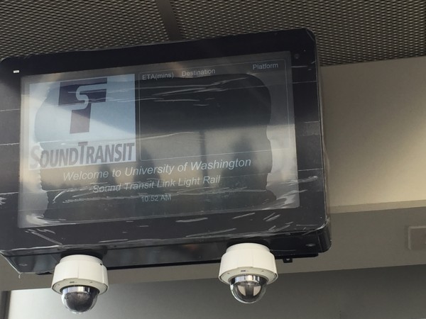
Along with training drivers, completing outreach and dotting i's, Sounds Transit has displayed the prototype design for their new dynamic station signage. The signs will show riders important information about next train arrivals, rider alerts, and transit network issues. Oran Viriyincy of the Seattle Transit Blog visited UW Station to take a look at what the future signs offered, but was less than impressed
The biggest problem with the design is it attempts to cram too much information on a single screen, resulting in text much smaller than the signs they replaced. The most important information on the screen, the train times, is given a third of the space with very small text that is difficult to read from a distance or while walking. Two-thirds of the screen is dedicated to irrelevant information like the Sound Transit logo and the welcome message. Such information belongs on permanent station signage, not a dynamic screen like this.
Oran explains that he has been in contact with Sound Transit regarding changes he wishes ST to make to their signage and that ST is responding well to his ideas. As a guideline for good station signage, Oran provides Los Angeles' LA Metro's signage. Two screens visible to entering riders display the next trains, rider alerts in yellow, and the current time over several screens.
The new design gives each element its own screen for a few seconds at a time. This allows the layout of each screen to be tailored for the message. Service alerts are given a bright yellow and bold text to call attention. Eye catching, full-screen graphics can be used for marketing and public service announcements. Train times can be shown in large text that can be seen from afar. Even the date and time has its own screen. Each screen can be given a different weight so some screens stay up longer or show more frequently than others or in the case of an emergency, normal programming can be overridden to give important messages.
Sound Transit needs to change the format of their signs. I agree with Oran that the signage is far too divided and doesn't display the most important information in a visible fashion. Too much room is divided to the logo of the transit company, a completely worthless image to riders. But I disagree with Oran that LA Metro provides a good example for ST to follow.
Let's consider what a rider for U-Link is going to want to see on a sign, in list of most to least important:
Transit alerts that affect their trip
Time till the next train leaves
The current time
Transit alerts that don't affect their trip
A key difference with the signage for LA Metro and ST is that ST's signs are outside the building, visible for roughly ten seconds while a person walks through the station entrance. In the video above, the station signs are being used above the boarding platform. If ST cycled through the information at the same pace LA Metro does, a rider would have to stop and wait to see the travel times (potentially losing out on crucial time to get to the platform if a train leaves soon) or continue on with incomplete information.
LA Metro clearly cycles through screens as a result of too much information to display all on one. But ST differs also differs from LA Metro in the total amount of information ST needs to display: ST only has one working Link line. In 2023, a second line will open, but beyond these two lines, ST is only in the beginning design phases for additional ones. It's unlikely ST will run out of room and have to scroll or switch screens for riders to be fully knowledgeable about transit information.
12:30pm
U District
3, 17
Downtown
6, 20
With the necessity for important transit alerts, the single light rail line, and plenty of space on the boards, I believe ST should pursue a single paged notice board, and not follow in the footsteps of LA Metro. On the board, time, next two train arrivals, and rider alerts could all easily share the space, especially if wasteful content headers are forgoed. Doing so could provide riders will all the information on one screen, and not cause further delays to their trip in and out of the U District. I provided a mockup of what I think Link's signage could look like above.
All image and video content credited to the Seattle Transit Blog. Thank you for your consistent work!


 Sound Transit's Link Light Rail U-Link expansion opens up in less than two months. Under budget and ahead of schedule, the project's completion marks a huge success for the agency.